How I built my course platform
I've worked on my animation course for the last 9 months and launched it last week. I thought it could be interesting to write about how I built the platform for it, talk about the design process, tech stack, and more.
Why a custom platform?
I want to build things that I can be proud of. While there are a few course creation platforms out there, I wanted something that feels like me and something that I can customize to my needs, so that the students can get the best experience possible.
The design process
People often call good animations buttery smooth, so I thought it would be a good idea to use a buttery yellow as the accent color. Based on that, we also worked on a melting butter logo with Nev Flynn.
I'm a big fan of courses myself. I already knew that I wanted my platform to look like a mix of Josh Comeau's courses and Sam Selikoff's buildui.com. Mariana helped me with the design, it wouldn't have looked the same without her help.
We've chosen Inter as the sans font as it's readable. The mono font is called Commit Mono; I absolutely love it. I'm using it for this site and in VSCode as well.
Initially, everything was centered, with a video on top followed by a written version of the lesson below it with navigation next to the text.
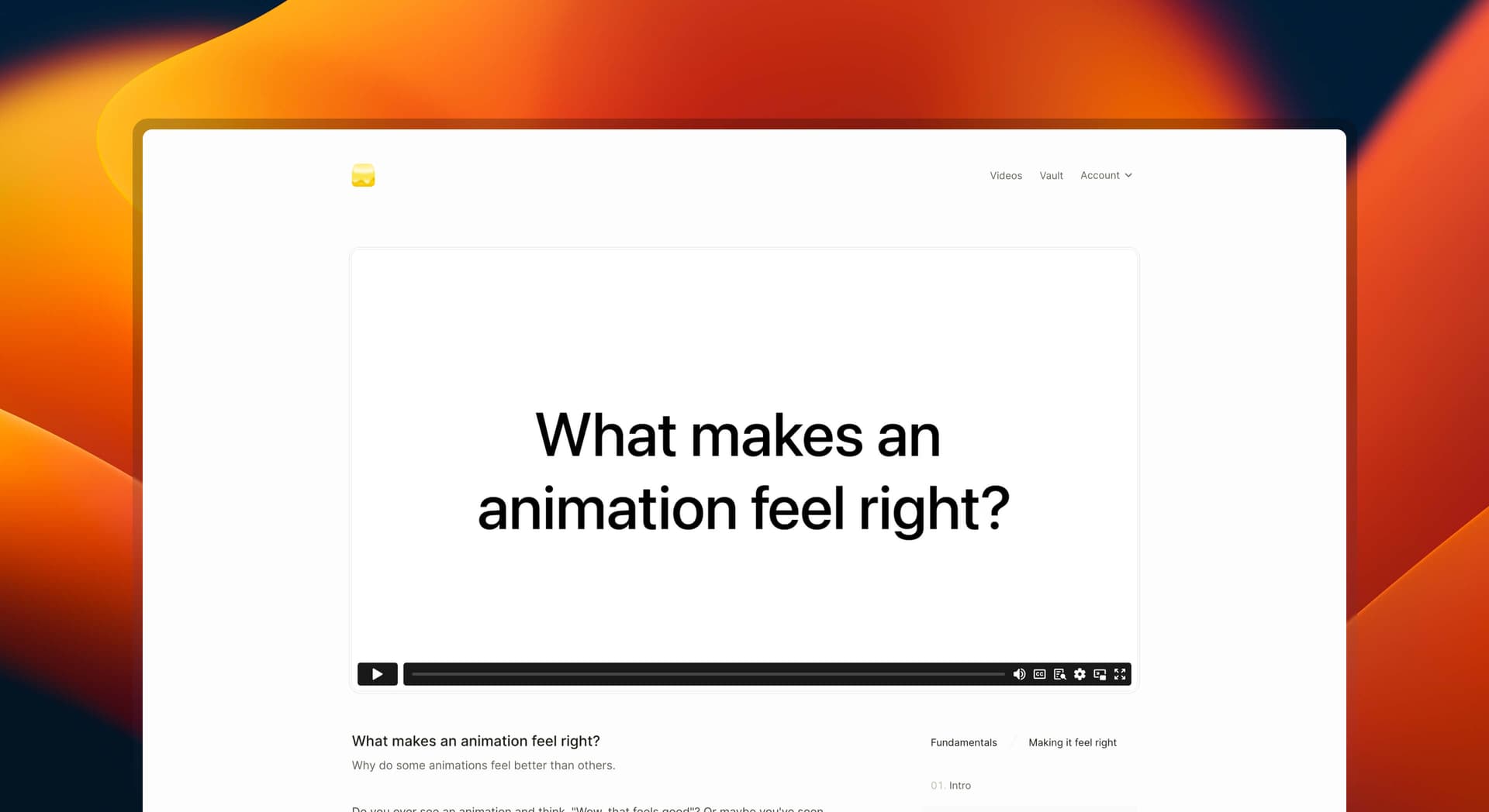
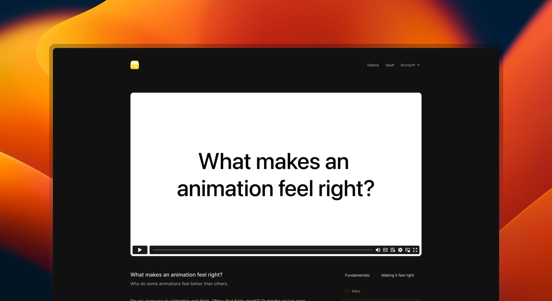
But when I started working on the second module which involved code, I quickly realized that the layout needs to change to account for the live editor. I added a sidebar and made the main section wider.
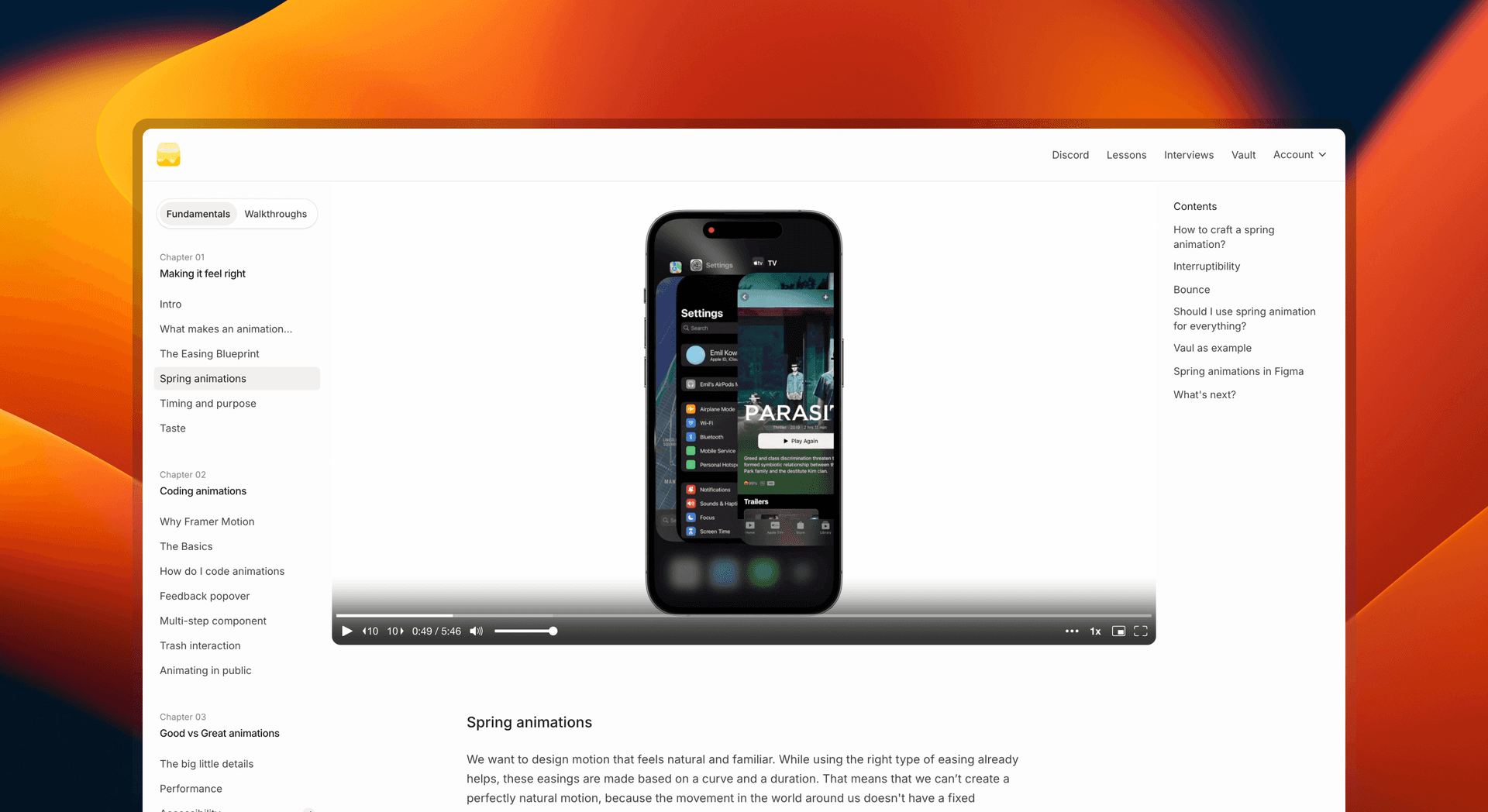
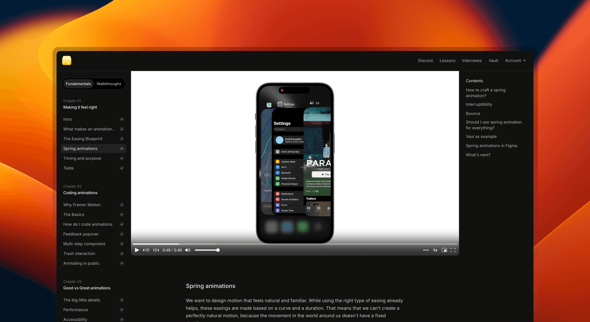
The colors come from Radix; I'm using the sand color scale. Radix Colors are my go-to for almost all of my projects. They have light and dark mode variants and describe the use case for each color.
I setup my colors in Tailwind using css variables. This way I don't need to use the dark modifier, but instead I just adjust the variables in dark mode once. This is how my colors look like in tailwind.config.ts:
colors: {
  gray: {
    100: "var(--color-gray-100)",
    200: "var(--color-gray-200)",
    300: "var(--color-gray-300)",
    400: "var(--color-gray-400)",
    500: "var(--color-gray-500)",
    600: "var(--color-gray-600)",
    700: "var(--color-gray-700)",
    800: "var(--color-gray-800)",
    900: "var(--color-gray-900)",
    1000: "var(--color-gray-1000)",
    1100: "var(--color-gray-1100)",
    1200: "var(--color-gray-1200)",
  }
}colors: {
gray: {
100: "var(--color-gray-100)",
200: "var(--color-gray-200)",
300: "var(--color-gray-300)",
400: "var(--color-gray-400)",
500: "var(--color-gray-500)",
600: "var(--color-gray-600)",
700: "var(--color-gray-700)",
800: "var(--color-gray-800)",
900: "var(--color-gray-900)",
1000: "var(--color-gray-1000)",
1100: "var(--color-gray-1100)",
1200: "var(--color-gray-1200)",
}
}Tech stack
The course is built using Next.js, I'm using app router. Authentication and storing user data is handled through Supabase. Each lesson is an mdx file. I style the app using tailwindcss. To help keep my classes readable, I use tailwind's prettier plugin.
Authentication
Users can log in using a magic link. I use Lemonsqueezy for payments, their API lets me check whether the entered email is a paying customer.
export async function GET(request: Request) {
  const { searchParams } = new URL(request.url);
  const email = searchParams.get("email");

  const res = await fetch(
    `https://api.lemonsqueezy.com/v1/customers?filter[email]=${email}`,
    {
      headers: {
        Authorization: `Bearer ${process.env.LEMON_SQUEEZY_KEY}`,
        Accept: "application/json",
      },
    }
  );

  const { data: foundCustomers } = await res.json();

  // ...
}
export async function GET(request: Request) {
const { searchParams } = new URL(request.url);
const email = searchParams.get("email");
const res = await fetch(
`https://api.lemonsqueezy.com/v1/customers?filter[email]=${email}`,
{
headers: {
Authorization: `Bearer ${process.env.LEMON_SQUEEZY_KEY}`,
Accept: "application/json",
},
}
);
const { data: foundCustomers } = await res.json();
// ...
}We then generate a magic link that gets passed to the sendEmail function, which sends an email using loops. I decided to generate the link myself, because I wanted to style my emails rather than use the defaults from Supabase.
const { data, error } = await admin.auth.admin.generateLink({
  email: email,
  type: "magiclink",
});
const { data, error } = await admin.auth.admin.generateLink({
email: email,
type: "magiclink",
});MDX
MDX allows me to include my own React components, this way I can help explain some concepts by providing interactive examples. The example below is used in the course to help students understand how each spring property affects an animation.
This visualizer is inspired by Morses's work.
Or this one below where we talk about interruptibility. This allows the students to "touch" and play with the concept to understand it better. There are lots of such interactive examples in the course.
Click around the box to move the ball.
When it comes to the setup, I wanted to keep this platform very simple and limit the number of external dependencies. I went with the most basic MDX setup possible, which is described here. You can see how I structure my files below.
---
title: "What makes an animation feel right?"
description: "Why some animations feel better than others."
video: "video-id"
resources:
  [
    {
      name: "Designing Fluid Interfaces",
      url: "https://developer.apple.com/videos/play/wwdc2018/803",
    },
    {
      name: "Invisible Details of Interaction Design",
      url: "https://rauno.me/craft/interaction-design",
    },
  ]
---

Some course content here about spring animations.
---
title: "What makes an animation feel right?"
description: "Why some animations feel better than others."
video: "video-id"
resources:
[
{
name: "Designing Fluid Interfaces",
url: "https://developer.apple.com/videos/play/wwdc2018/803",
},
{
name: "Invisible Details of Interaction Design",
url: "https://rauno.me/craft/interaction-design",
},
]
---
Some course content here about spring animations.Components
I have a few reusable components like a button, but the rest is made when needed. I'm often using Radix to get the accessibility right without spending too much time on it. I also use Vaul as a side drawer on mobile.
Video player
I initially started with Vimeo, but over time I switched to Mux. Mux is more developer friendly in my opinion and the price is lower. On top of that it's fully customizable. The plan is to redesign the video player in the future so that it's more in line with the rest of the platform. This is how my implementation of Mux looks like in code:
import MuxPlayer from "@mux/mux-player-react";

// ...

<MuxPlayer
  streamType="on-demand"
  playbackId={video}
  primaryColor="#FFFFFF"
  className="aspect-video"
  accentColor="#F8C819"
  onEnded={() => setEnded(true)}
/>
import MuxPlayer from "@mux/mux-player-react";
// ...
<MuxPlayer
streamType="on-demand"
playbackId={video}
primaryColor="#FFFFFF"
className="aspect-video"
accentColor="#F8C819"
onEnded={() => setEnded(true)}
/>Purchase Power Parity
I want this course to be accessible for everyone. That's why eventhough the price is relatively low, I decided to add PPP. I'm using ParityDeals to calculate the price based on user's location and show the appropriate discount code.


Why didn't I build it myself? It seemed like it could be pretty time consuming if I wanted to do it right. ParityDeals has an integration with Lemonsqueezy and protects against VPNs. But it might be easier to build than I think and I might give it a try in the future.
When it comes to the code, it's a simple API call in a server component that is wrapped in a <Suspense /> to not block the rendering of the page. The code below is a simplified version of what I'm using.
import { headers } from "next/headers";

function IP() {
  const FALLBACK_IP_ADDRESS = "0.0.0.0";
  const forwardedFor = headers().get("x-forwarded-for");

  if (forwardedFor) {
    return forwardedFor.split(",")[0] ?? FALLBACK_IP_ADDRESS;
  }

  return headers().get("x-real-ip") ?? FALLBACK_IP_ADDRESS;
}

async function getDiscountCode() {
  const res = await fetch(
    `api call to ParithDeals with IP()`,
  );
  const data = await res.json();
  return data;
}

export async function PurchasePowerParity() {
  const data = await getDiscountCode();

  if (!data.couponCode) return null;


  return (
	<DiscountBanner code={data.couponCode} />
  )
}
import { headers } from "next/headers";
function IP() {
const FALLBACK_IP_ADDRESS = "0.0.0.0";
const forwardedFor = headers().get("x-forwarded-for");
if (forwardedFor) {
return forwardedFor.split(",")[0] ?? FALLBACK_IP_ADDRESS;
}
return headers().get("x-real-ip") ?? FALLBACK_IP_ADDRESS;
}
async function getDiscountCode() {
const res = await fetch(
`api call to ParithDeals with IP()`,
);
const data = await res.json();
return data;
}
export async function PurchasePowerParity() {
const data = await getDiscountCode();
if (!data.couponCode) return null;
return (
<DiscountBanner code={data.couponCode} />
)
}Feedback
There is a feedback form at the end of each lesson. This makes it very easy for students to share their thoughts and is very insightful for me.
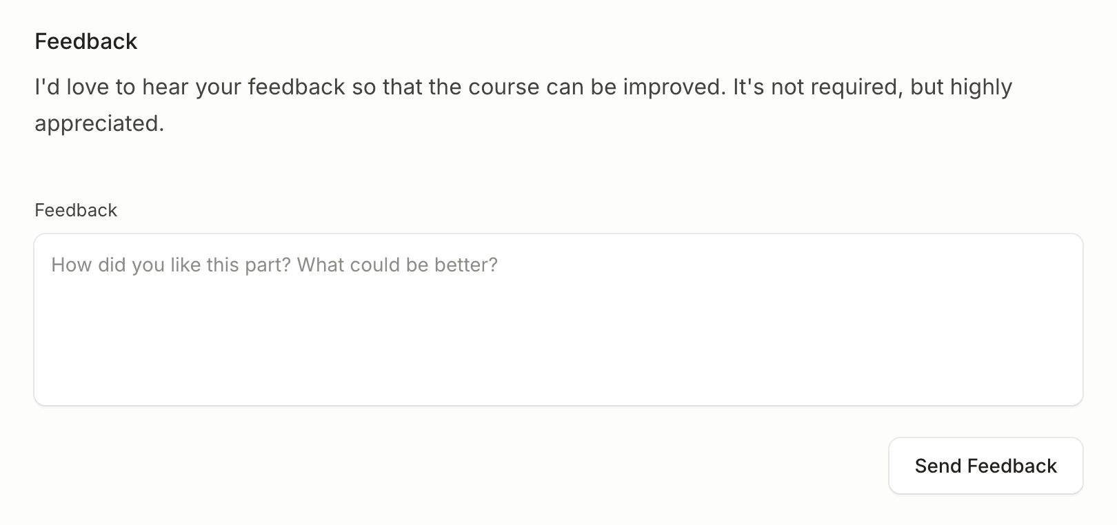
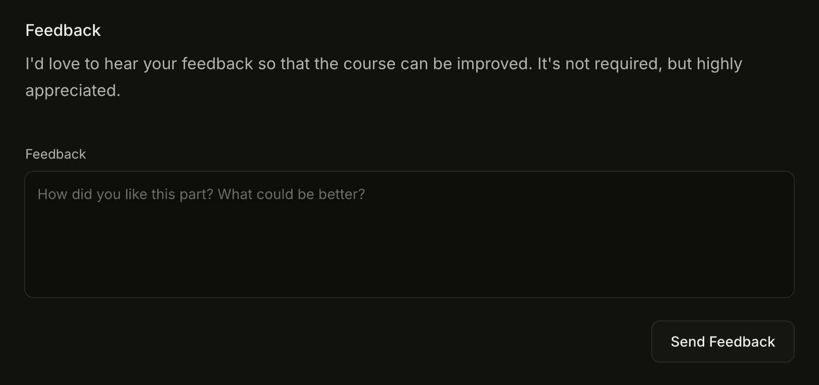
I also made a very simple Next.js app to render the feedback as the Supabase UI is quite cramped, especially on mobile.
import { supabase } from "./utils/supabase";

export const dynamic = "force-dynamic";

export default async function Page() {
  const { data } = await supabase
    .from("feedback")
    .select()
    .limit(10)
    .order("created_at", { ascending: false });

  return (
    <div className="my-24 space-y-8">
      {data.map((feedback) => (
        <div className="rounded-xl p-4 text-sm shadow-sm" key={feedback.email}>
          <div className="mb-4 flex items-center justify-between">
            <span className="text-sm font-medium">{feedback.email}</span>
            <span className="font-mono text-[11px]">{feedback.page}</span>
          </div>
          <p className="opacity-75">{feedback.content}</p>
        </div>
      ))}
    </div>
  );
}
import { supabase } from "./utils/supabase";
export const dynamic = "force-dynamic";
export default async function Page() {
const { data } = await supabase
.from("feedback")
.select()
.limit(10)
.order("created_at", { ascending: false });
return (
<div className="my-24 space-y-8">
{data.map((feedback) => (
<div className="rounded-xl p-4 text-sm shadow-sm" key={feedback.email}>
<div className="mb-4 flex items-center justify-between">
<span className="text-sm font-medium">{feedback.email}</span>
<span className="font-mono text-[11px]">{feedback.page}</span>
</div>
<p className="opacity-75">{feedback.content}</p>
</div>
))}
</div>
);
}Vault
Vault is a collection of resources that can help students learn more about animations. It's just an array of objects that I'm rendering in a list.
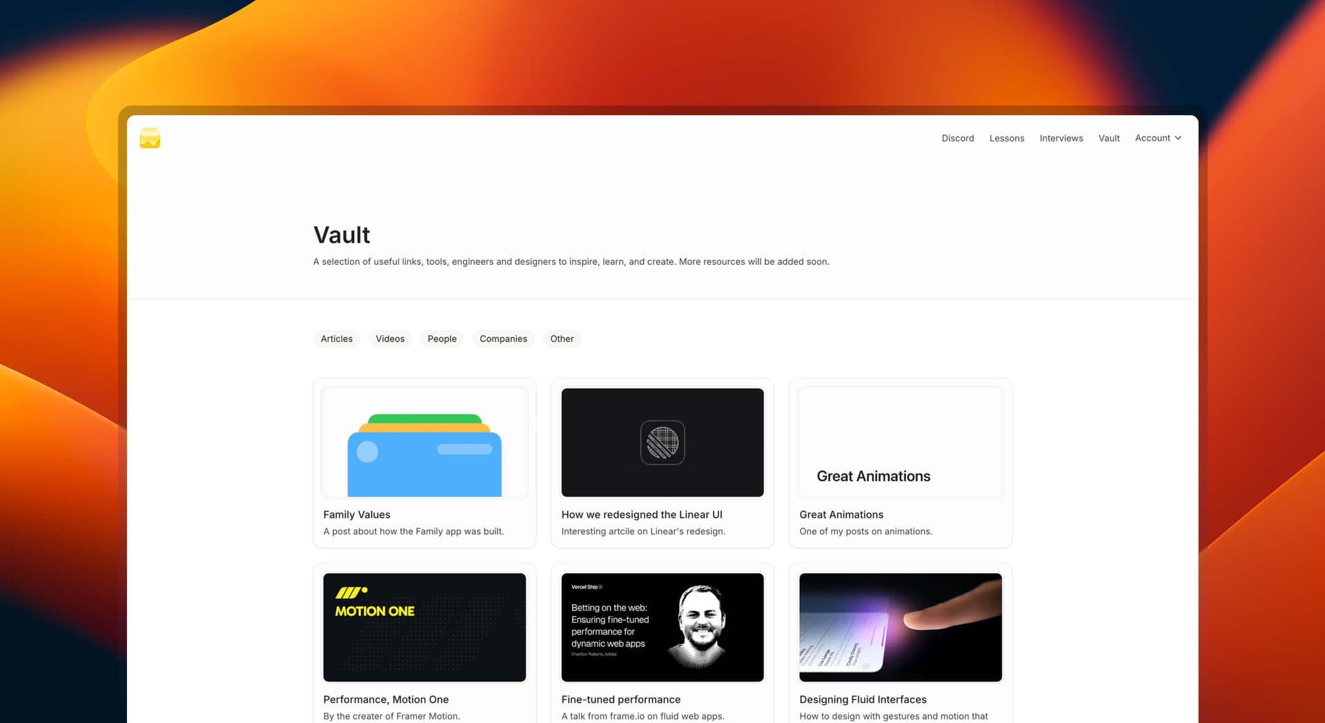
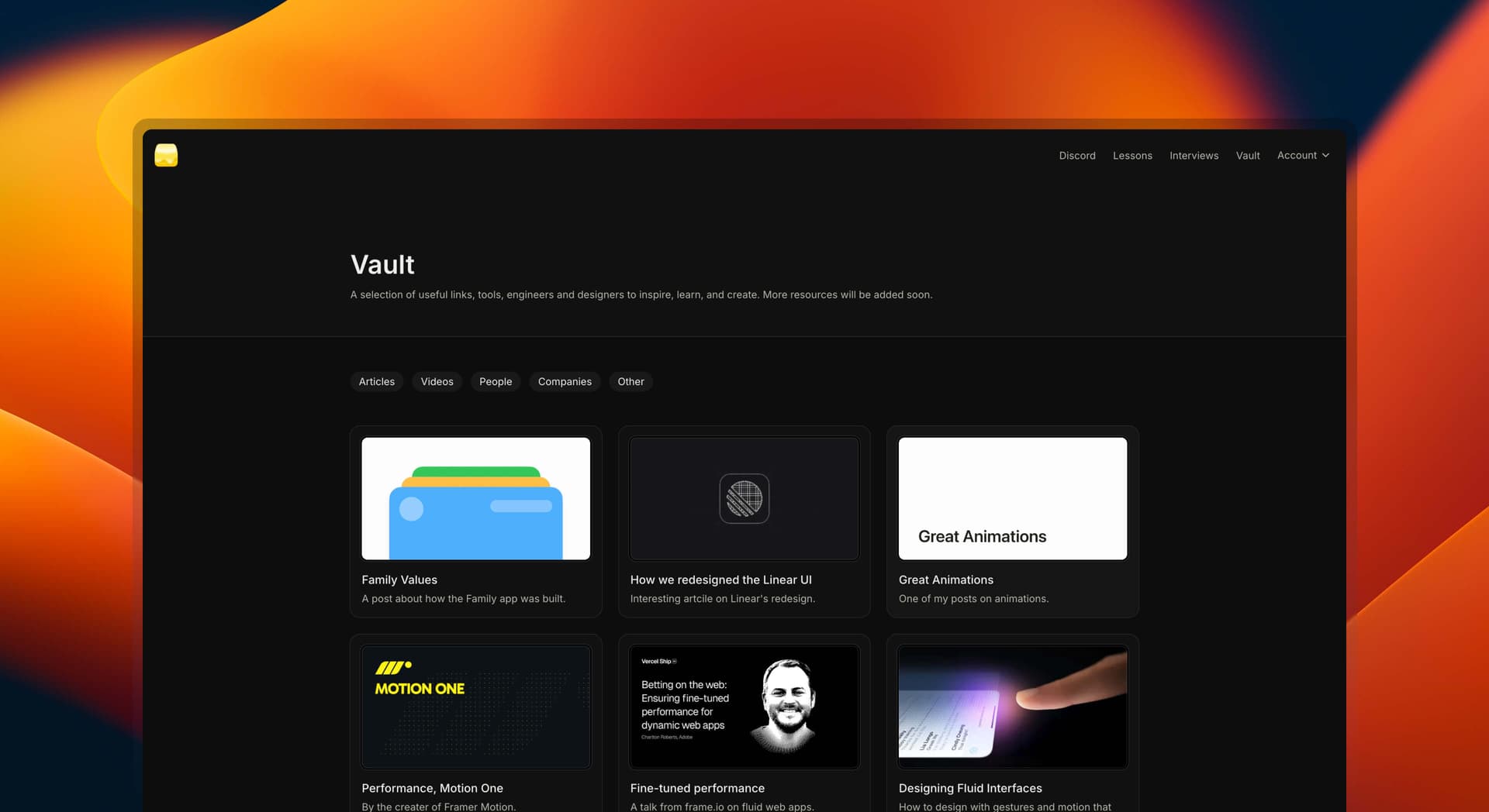
The visuals are curated manually by me. Usually, they are just OG images from the links, but in case of a youtube video or something that just doesn't have a great OG I find a better image that still fits the content.
Code editor
I believe that in order to learn something, you need to practice. That's why there are lots of exercises in the course. But I didn't want users to have to clone a repo, it takes time and can be frustrating. Instead, I decided to build a live editor where users can write code and see the result right away.
"use client";

import { useEffect, useRef, useState } from "react";

export default function TabsClipPath() {
  const [activeTab, setActiveTab] = useState(TABS[0].name);
  const containerRef = useRef(null);
  const activeTabElementRef = useRef(null);

  useEffect(() => {
    const container = containerRef.current;

    if (activeTab && container) {
      const activeTabElement = activeTabElementRef.current;

      if (activeTabElement) {
        const { offsetLeft, offsetWidth } = activeTabElement;

        const clipLeft = offsetLeft;
        const clipRight = offsetLeft + offsetWidth;
        container.style.clipPath = `inset(0 ${Number(100 - (clipRight / container.offsetWidth) * 100).toFixed()}% 0 ${Number((clipLeft / container.offsetWidth) * 100).toFixed()}% round 17px)`;
      }
    }
  }, [activeTab, activeTabElementRef, containerRef]);

  return (
    <div className="wrapper">
      <ul className="list">
        {TABS.map((tab) => (
          <li key={tab.name}>
            <button
              ref={activeTab === tab.name ? activeTabElementRef : null}
              data-tab={tab.name}
              onClick={() => {
                setActiveTab(tab.name);
              }}
              className="button"
            >
              {tab.icon}
              {tab.name}
            </button>
          </li>
        ))}
      </ul>

      <div aria-hidden className="clip-path-container" ref={containerRef}>
        <ul className="list list-overlay">
          {TABS.map((tab) => (
            <li key={tab.name}>
              <button
                data-tab={tab.name}
                onClick={() => {
                  setActiveTab(tab.name);
                }}
                className="button-overlay button"
				tabIndex={-1}
              >
                {tab.icon}
                {tab.name}
              </button>
            </li>
          ))}
        </ul>
      </div>
    </div>
  );
}

const TABS = [
  {
    name: "Payments",
    icon: (
      <svg
        aria-hidden="true"
        width="16"
        height="16"
        viewBox="0 0 16 16"
        fill="none"
        xmlns="http://www.w3.org/2000/svg"
      >
        <path
          fillRule="evenodd"
          clipRule="evenodd"
          fill="currentColor"
          d="M0 3.884c0-.8.545-1.476 1.306-1.68l.018-.004L10.552.213c.15-.038.3-.055.448-.055.927.006 1.75.733 1.75 1.74V4.5h.75A2.5 2.5 0 0 1 16 7v6.5a2.5 2.5 0 0 1-2.5 2.5h-11A2.5 2.5 0 0 1 0 13.5V3.884ZM10.913 1.67c.199-.052.337.09.337.23v2.6H2.5c-.356 0-.694.074-1 .208v-.824c0-.092.059-.189.181-.227l9.216-1.984.016-.004ZM1.5 7v6.5a1 1 0 0 0 1 1h11a1 1 0 0 0 1-1V7a1 1 0 0 0-1-1h-11a1 1 0 0 0-1 1Z"
        ></path>
        <path
          fillRule="evenodd"
          clipRule="evenodd"
          fill="currentColor"
          d="M10.897 1.673 1.681 3.657c-.122.038-.181.135-.181.227v.824a2.492 2.492 0 0 1 1-.208h8.75V1.898c0-.14-.138-.281-.337-.23m0 0-.016.005Zm-9.59.532 9.23-1.987c.15-.038.3-.055.448-.055.927.006 1.75.733 1.75 1.74V4.5h.75A2.5 2.5 0 0 1 16 7v6.5a2.5 2.5 0 0 1-2.5 2.5h-11A2.5 2.5 0 0 1 0 13.5V3.884c0-.8.545-1.476 1.306-1.68l.018-.004ZM1.5 13.5V7a1 1 0 0 1 1-1h11a1 1 0 0 1 1 1v6.5a1 1 0 0 1-1 1h-11a1 1 0 0 1-1-1ZM13 10.25c0 .688-.563 1.25-1.25 1.25-.688 0-1.25-.55-1.25-1.25 0-.688.563-1.25 1.25-1.25.688 0 1.25.562 1.25 1.25Z"
        ></path>
      </svg>
    ),
  },
  {
    name: "Balances",
    icon: (
      <svg
        data-testid="primary-nav-item-icon"
        aria-hidden="true"
        width="16"
        height="16"
        viewBox="0 0 16 16"
        fill="none"
        xmlns="http://www.w3.org/2000/svg"
      >
        <path
          fill="currentColor"
          d="M1 2a.75.75 0 0 1 .75-.75h7.5a.75.75 0 0 1 0 1.5h-7.5A.75.75 0 0 1 1 2Zm0 8a.75.75 0 0 1 .75-.75h5a.75.75 0 0 1 0 1.5h-5A.75.75 0 0 1 1 10Zm2.25-4.75a.75.75 0 0 0 0 1.5h7.5a.75.75 0 0 0 0-1.5h-7.5ZM2.5 14a.75.75 0 0 1 .75-.75h4a.75.75 0 0 1 0 1.5h-4A.75.75 0 0 1 2.5 14Z"
        ></path>
        <path
          fillRule="evenodd"
          clipRule="evenodd"
          fill="currentColor"
          d="M16 11.5a3.5 3.5 0 1 1-7 0 3.5 3.5 0 0 1 7 0Zm-1.5 0a2 2 0 1 1-4 0 2 2 0 0 1 4 0Z"
        ></path>
      </svg>
    ),
  },
  {
    name: "Customers",
    icon: (
      <svg
        aria-hidden="true"
        width="16"
        height="16"
        viewBox="0 0 16 16"
        fill="none"
        xmlns="http://www.w3.org/2000/svg"
      >
        <path
          fillRule="evenodd"
          clipRule="evenodd"
          fill="currentColor"
          d="M2.5 14.4h11a.4.4 0 0 0 .4-.4 3.4 3.4 0 0 0-3.4-3.4h-5A3.4 3.4 0 0 0 2.1 14c0 .22.18.4.4.4Zm0 1.6h11a2 2 0 0 0 2-2 5 5 0 0 0-5-5h-5a5 5 0 0 0-5 5 2 2 0 0 0 2 2ZM8 6.4a2.4 2.4 0 1 0 0-4.8 2.4 2.4 0 0 0 0 4.8ZM8 8a4 4 0 1 0 0-8 4 4 0 0 0 0 8Z"
        ></path>
      </svg>
    ),
  },
  {
    name: "Billing",
    icon: (
      <svg
        aria-hidden="true"
        width="16"
        height="16"
        viewBox="0 0 16 16"
        fill="none"
        xmlns="http://www.w3.org/2000/svg"
      >
        <path
          fill="currentColor"
          d="M0 2.25A2.25 2.25 0 0 1 2.25 0h7.5A2.25 2.25 0 0 1 12 2.25v6a.75.75 0 0 1-1.5 0v-6a.75.75 0 0 0-.75-.75h-7.5a.75.75 0 0 0-.75.75v10.851a.192.192 0 0 0 .277.172l.888-.444a.75.75 0 1 1 .67 1.342l-.887.443A1.69 1.69 0 0 1 0 13.101V2.25Z"
        ></path>
        <path
          fill="currentColor"
          d="M5 10.7a.7.7 0 0 1 .7-.7h4.6a.7.7 0 1 1 0 1.4H7.36l.136.237c.098.17.193.336.284.491.283.483.554.907.855 1.263.572.675 1.249 1.109 2.365 1.109 1.18 0 2.038-.423 2.604-1.039.576-.626.896-1.5.896-2.461 0-.99-.42-1.567-.807-1.998a.75.75 0 1 1 1.115-1.004C15.319 8.568 16 9.49 16 11c0 1.288-.43 2.54-1.292 3.476C13.838 15.423 12.57 16 11 16c-1.634 0-2.706-.691-3.51-1.64-.386-.457-.71-.971-1.004-1.472L6.4 12.74v2.56a.7.7 0 1 1-1.4 0v-4.6ZM2.95 4.25a.75.75 0 0 1 .75-.75h2a.75.75 0 0 1 0 1.5h-2a.75.75 0 0 1-.75-.75ZM3.7 6.5a.75.75 0 0 0 0 1.5h4.6a.75.75 0 0 0 0-1.5H3.7Z"
        ></path>
      </svg>
    ),
  },
];
It's built using Sandpack. It's not perfect, there are still a few bugs and features on my list, but it gives the students a way to practice without leaving the platform.
The nice thing about Sandpack is that it exposes a useSandpack hook. This way I can use my own components in the editor and update it's state with the sandpack function. That's how I run prettier when the user presses cmd + s to save the file.
const { sandpack } = useSandpack();

// ...

sandpack.updateFile(sandpack.activeFile, prettierCode);
const { sandpack } = useSandpack();
// ...
sandpack.updateFile(sandpack.activeFile, prettierCode);Marketing
I think that if you build great things, they'll sell themselves. I never asked shadcn to add Sonner or Vaul to shadcn/ui, he did it because he liked those libraries, that's my guess at least.
I think about this course in the same way. If people will get value from it, they'll share it with others. Me posting 3 times a day about it would feel cheap and tasteless.
Max for example, the creator of MotionNumber (great library btw) tweeted about the course and there are many such cases of people promoting the course.
Emil's course taught me everything I know about UI animation
”What's next?
I'm currently working on a module that focuses purely on CSS animations. This will make the course available for a larger audience, as not everyone is using React and currently the majority of the course is focused on Framer Motion (a React library).
The registration will be closed on Friday October 4th and won't open until next year. I like to think about the course in "drops", each drop is an improved version of the course. That's why I'm often closing the registration for a few months.
This is also the last chance to get it at this price. The price will increase after this registration period.